Points of parity, points of difference, Jeep's success in America and Cooper Black font
Sometimes lifelong habits change in favor of a brand, if points of difference are well crafted
Points of Parity/Points of Difference
My sister is terrified of dogs. Can't bear to be with them.
When they enter the room, she runs to the other room.
But her kids really really really wanted a puppy.
She gave in.
So they got Ellie home.
She was a Bulldog.
She grew to be a big dog.
My sister never got used to her.
Unfortunately, Ellie died and after a year or so, a second puppy was brought in.
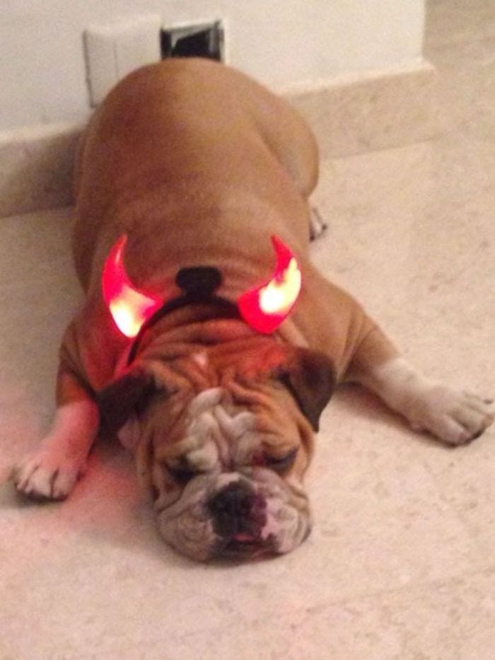
The second puppy is Bella. A Shih-Tzu.
Bella sleeps right next to my sister's bed. My sister takes care of her like her child. They spend every waking moment together.
What happened? How come, my sister, who had a lifelong fear of dogs, stuck to her pattern of being afraid of Ellie but melted when Bella entered the picture?
Because there was a point of difference between Bella and Ellie. Bella will not grow to be taller than a foot. She is a cute and tiny ball of soft cuddly fur. She is like a baby who needs to be taken care of. She stimulated my sister's maternal instincts.
This was unexpected.
Even my sister was surprised. Sometimes lifelong habits change in a blink. While designing brand propositions, it’s important to tick the boxes on points of parity - the non-negotiables for a consumer, (like the demand for a puppy and nothing else).
But it’s even more important to design the point of difference. The right point of difference could make the consumer fall in love with your product. Generally, points of difference bear deep emotional resonance and are laden with meaning, rich memories, and deep desires - like the maternal instinct that bubbled up at the sight of Bella's sweet face.
Usually, even consumers cannot tell us what they desire. The smallest of things that hit the right note can have unexpected results. And this is what makes designing points of difference so difficult but also exciting.
This brings me to the story of Jeep.
Jeep Wrangler
In the late 1990s, SUVs had taken share from the Jeep in the US. The point of difference for SUVs was that they were bigger, more luxurious, and spacious. They were favored by families and soccer moms for in-city errands.
Jeep wanted to match SUVs on points of parity. They wanted to add permanent doors, have a shiny exterior, and plush soft leather seats.
That would have been wrong because this would have only made Jeep a copycat. What Jeep really needed was a refreshed point of difference.
They asked Clotaire Rapaille for help.
When he delved into the cultural meaning of Jeep for Americans, he discovered that it stood for the experience of exploring the vast outdoor terrain, unbridled speed, and the freedom of feeling a breeze in the hair.
In short, it stood for Horse.
The new point of difference borrowed codes from horses. Clotaire recommended rough leather seats like that of a saddle, removable doors, an open top, and round headlights, to mimic horses' eyes.
The owners balked at making all of the changes but settled for a Jeep with round headlights because round headlights were cheaper than rectangular ones.
Sure enough, sales took off.
And Jeep acquired a cult following.
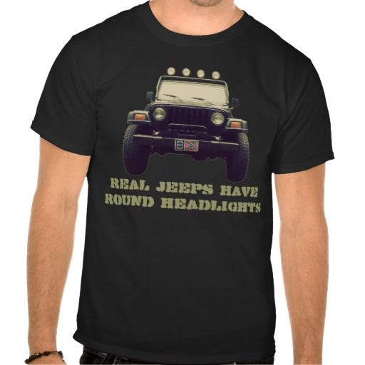
Jeep fan clubs popped up, that distributed T-shirts with slogans saying "Real Jeeps Have Round Headlights".
Here is an advertisement from that time, which hits all the right notes to establish the point of difference. (old ad so the quality is not great, but audio does the job).
Cooper Black
Speaking of points of difference. All fonts have shared parity. In that, all must be alphabets, numbers, and punctuation marks. But each and every font has a point of difference in its design.
And sometimes that difference can drive adoption over decades.
One of the most successful and frequently used fonts of all time is Cooper Black. It’s point of difference? Versatility. Versatility because of its rounded edges and boldface.
Here’s what happened.
After World War II, the printing industry was moving to type faces molded out of metal. Because they were molded out of metal, it was just easier to design fonts with straight lines and edges.
At the same time, there was a surge in demand for products post-depression of 1919, so the advertising industry was growing. Veteran-type designer Oswald Bruce Cooper was hired to create a font for advertising copy.
He created Cooper Black, in 1922.
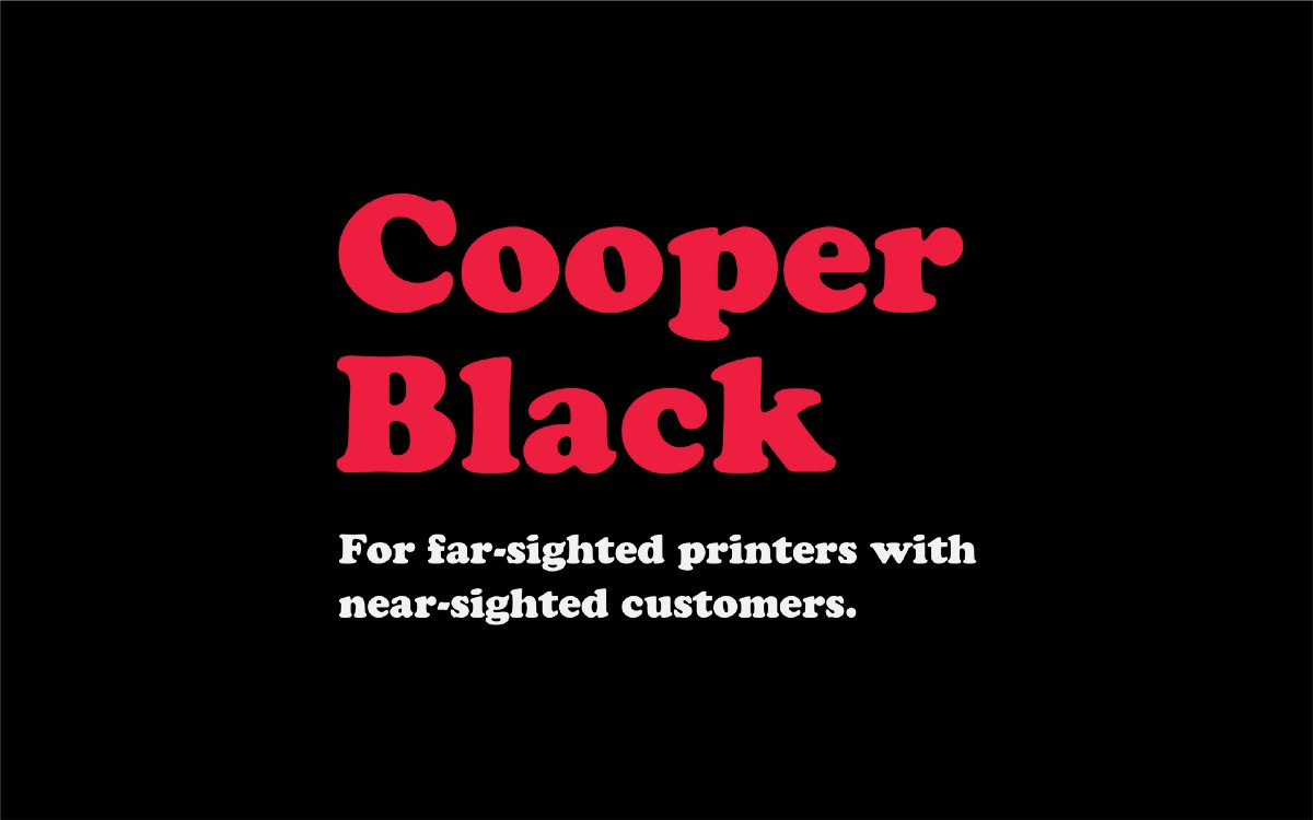
Cooper Black was really a Times New Roman font, rounded with thick luscious curves. It was advertised with the slogan: “For far-sighted printers with near-sighted customers.”
The rounded edges made it versatile because it was possible to expand the font into large posters and full-page ads, and at the same time, to squeeze into narrow spaces in the newspaper.
The rounded space inside the letters gave a pleasant appearance that did not tire the eye.
Cooper Black became The font of choice for the advertising industry at that time. It appeared on advertising, album covers, and T-shirts.
Simon and Garfunkle are quoted to have said this about the 'curves' in this font “the sort of font the oils in a lava lamp would form if smashed to the floor.”
In 1966 The Beach Boys released "Pet Sounds" featuring Cooper Black on the dust jacket. Overnight, it became the font for pop culture. To date, this font carries nostalgia for the 1960s.
Designing a point of difference - whether for our business or personal brand - is a craft. The more you do it, the better you will get at it.
And getting it right will make a big difference in outcomes.


